Newsletter template: four examples to download for free
A good newsletter template is a single column no wider than 600 pixels, with your logo at the top, a clear hierarchy of headings and text, one main button, alt text on every image, your message in real text, an unsubscribe link and the sender's address at the bottom. Lock those eight parts into a reusable template and each edition only needs its content replaced.
Below you first find the four starter templates of 2Mail as examples of a newsletter template, each free to download as HTML and with the situation the layout is meant for. Then what every template should contain, where it goes wrong in dark mode, on mobile and in Outlook, and how you build such a template in 2Mail's drag & drop builder.
Four newsletter templates in HTML
These are the four starter templates you begin with in 2Mail's template builder. You pick one, replace the text, colours and images, and save the result as your own template. Rather start from scratch? Then you begin with a blank canvas.
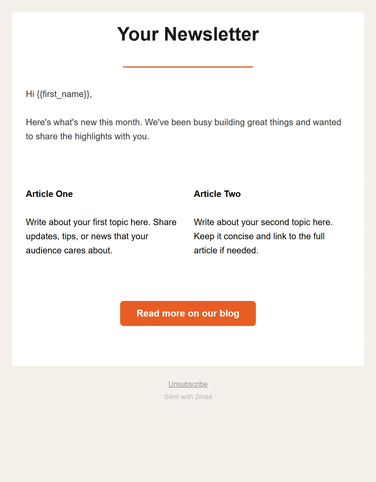
Newsletter
A heading with a coloured line underneath, a short introduction, two articles side by side, one button and a footer with an unsubscribe link. The layout for a newsletter with a fixed rhythm.
Download as HTML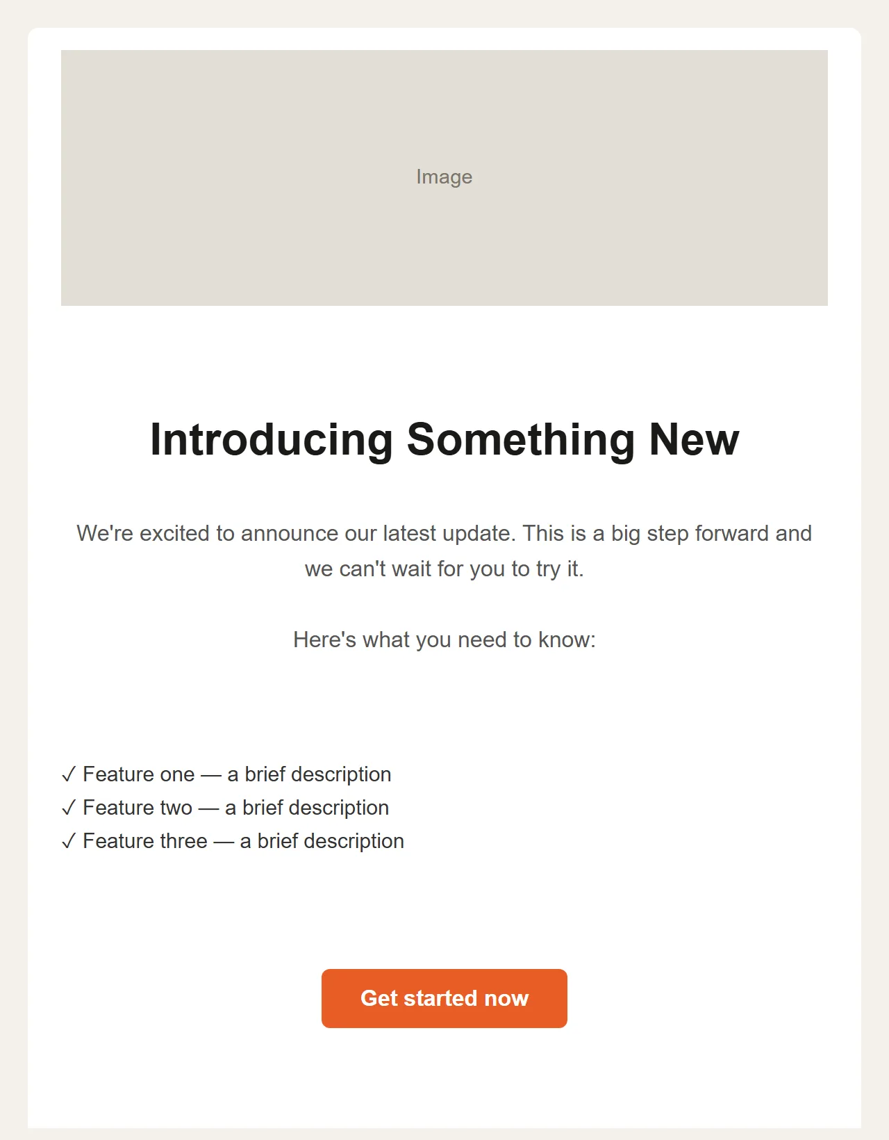
Announcement
A large image at the top, a heading, a short text, three points with a check mark and one clear button. For a launch, a new service or an offer.
Download as HTML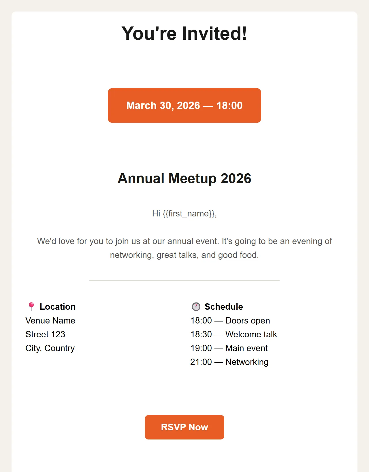
Event Invitation
A heading, an eye-catching date block, the name of the event, and below it location and programme side by side. The button leads to the registration.
Download as HTML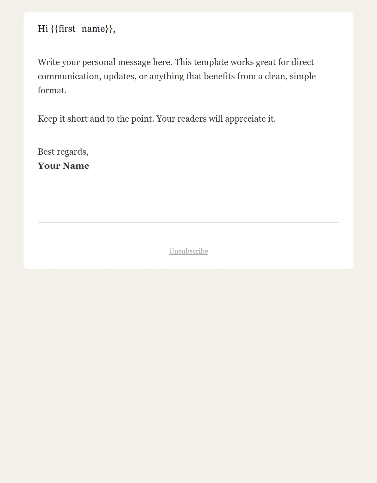
Simple Text
No images and no button: a greeting, your text, a signature and a footer with an unsubscribe link. It reads like a personal email.
Download as HTMLThe images are screenshots of the starter templates themselves, and each download is that same file: the HTML the 2Mail builder produces for that template. The sample text is placeholder copy that you replace with your own. Already a customer? Then choose "Start from template" in the builder: the same layout, but editable with blocks. A downloaded file is loaded through Templates → "Upload HTML" and then edited in the code editor.
Template, layout, design or format?
These words get used interchangeably and in practice mean the same thing: the fixed design you pour each edition into. "Template" points at the reusable file, "layout" and "format" more at how it is arranged.
The layout of a newsletter
The layout is the order and rhythm of the blocks: what sits at the top, how many topics follow and where the button goes. A single column is the safe choice; two columns are fine for a product grid, provided they stack underneath each other on mobile.
The header of a newsletter
The header is the strip above the first heading: your logo, linked to your website, and optionally a link to view the email in the browser. Keep it low and calm. A navigation menu with six links belongs on a website, not in an email, and pushes the content down.
Format and dimensions
The common format is 600 pixels wide, with images you supply at double width so they stay sharp on a phone. The length is up to you, but keep the HTML light: Gmail clips a message once the code goes above roughly 100 kB, and then your unsubscribe link disappears too.
Newsletter design: the eight parts of a good template
Not design preferences, but parts that each prevent a concrete problem: unreadability, spam filters, complaints or a legal obligation you forget.
One column, 600 pixels wide
A single column reads the same everywhere, from a wide screen to a phone. 600 pixels is the width almost every mail client shows without a horizontal scrollbar.
Your logo at the top
The recipient must see at a glance who the mail is from. The logo links to your website and sits above the first heading, not as a big banner pushing the content down.
A clear hierarchy
One main heading, subheadings per topic and short paragraphs. Someone scanning must know within five seconds what the mail is about. Use font sizes that stay readable on a small screen.
One main button
Every newsletter has one thing you want the reader to do: order, sign up, read. Give that action a button set as text, not as an image, so it stays visible even without images.
Alt text on every image
Several mailboxes only show images after a click. The alt text is then what the reader sees. Without alt text, an image-heavy newsletter is reduced to white space.
Your message in real text
Put what you have to say in text blocks, not in one large image. Spam filters distrust an email that consists of images only, and anyone who has images blocked then sees nothing. Real text always stays readable.
An unsubscribe link
Mandatory, and in your own interest: whoever cannot unsubscribe clicks 'spam', and that weighs more than an unsubscribe. Put the link visibly at the bottom, in plain language.
The sender's address
Your company name and postal address at the bottom of every newsletter. It is a legal requirement and a trust signal at the same time: a real company, at a real address.
Dark mode, mobile and Outlook
A template that looks good in your browser is not finished yet. Three environments cause most of the surprises.
Dark mode
Mail clients in dark mode invert or adjust your colours. A dark logo on a transparent background disappears; white text in a coloured button becomes unreadable. Use logos with their own background and test in dark mode before you send.
Mobile
A large share of your recipients reads on a phone. A single column scales by itself, but buttons must be large enough to hit with a thumb, and font sizes under 14 pixels get zoomed or ignored on mobile.
Outlook
The desktop version of Outlook uses its own rendering engine that does not know much modern CSS: background images, rounded corners and some spacing drop out. Build your template on tables, keep the styling simple and send a test to an Outlook account.
Testing in real mailboxes is therefore not a formality. In 2Mail, create a small test group with your own addresses and send the campaign there first, to at least three real mailboxes: a webmail, a phone and Outlook on a PC. What looks right there looks right almost everywhere.
2Mail's template builder
You do not need to write HTML. The drag & drop template builder in the dashboard turns the eight parts above into blocks you drag, fill in and save.
Drag blocks
Text, image, button, divider and columns: you drag the blocks into the order you want and fill them in. The builder keeps the width and the structure in order and builds the HTML on tables, with provisions for Outlook.
Reusable templates
Save your layout as a template and reuse it for every edition. Logo, colours, footer and unsubscribe link stay fixed; you only replace the content. Every newsletter stays recognisable and no mandatory part gets forgotten.
Live preview on desktop and mobile
While you build, you see the email in a live preview and switch between the desktop and the mobile view in one click. If you want to see it in a real mailbox, send the campaign first to a small test group with your own addresses and those of your colleagues, and only then to your list.
Building a template in five steps
Count on half a day for the first version. After that a new edition only costs you the time to write the content.
Choose the structure
Start with one column of 600 pixels and settle the order: logo, main heading, intro, two or three topics, button, footer. Sketch it on paper before you open the builder; that is faster than dragging back and forth.
Place the fixed parts
Set the blocks that return in every edition in the builder: the logo, the colours, the footer with your company name and postal address, and the unsubscribe link. This is the part you never touch again.
Fill in the content and the main button
Write a heading and two or three sentences per topic, add an image with alt text and place one clear button. Check in the live preview how the whole thing looks on desktop and on mobile.
Test in real mailboxes
Create a small test group with your own addresses and send the campaign there first: to a webmail, a phone and an Outlook account. Look at it in dark mode too. Fix whatever shifts or disappears and test again.
Save it as a template
Store the tested layout as a reusable template. You start the next edition from that template and only replace the content, so the design and the mandatory parts stay intact.
Checklist before you send
Run through these six points for every edition. They take two minutes and prevent the mistakes you can no longer recall once the campaign has left.